Hey there, fellow app developers for Chromebook and digital entrepreneurs! If you’re anything like me, you’re always on the lookout for that extra edge in the cutthroat world of app marketing. Well, buckle up, because I’m about to let you in on a little secret that’s been a game-changer for my apps – and it could be for yours too.
Imagine this: You’ve poured your heart and soul (not to mention countless caffeine-fueled nights) into creating an amazing app. It’s slick, it’s functional, and you just know users are going to love it. But here’s the million-dollar question: How do you make sure it stands out in the vast ocean of apps out there?
Enter the unsung hero of ChromeOS app marketing: the Add to Chromebook badge.
Now, I know what you’re thinking. “Great, another badge to slap on my website. Big deal, right?” Wrong! This isn’t just any old badge we’re talking about here. This little beauty is your golden ticket to tapping into the booming Chromebook market. And let me tell you, that market is hot right now.
When I first stumbled upon this badge, I was skeptical. I mean, how much difference could one tiny graphic really make? But boy, was I in for a surprise. After implementing it on my app’s landing page, I saw a noticeable uptick in Chromebook user engagement almost overnight. It was like I’d suddenly unlocked a whole new audience I didn’t even know I was missing out on.
But here’s the kicker – not everyone knows how to use this badge effectively. I’ve seen so many developers slap it on their site without a second thought, missing out on its full potential. That’s why I decided to put together this comprehensive guide. I’m going to walk you through everything I’ve learned about the Add to Chromebook badge – from why it’s a big deal, to the nitty-gritty of implementation, right down to the common pitfalls you need to avoid.
Whether you’re a seasoned app developer looking to expand your reach, or you’re just dipping your toes into the world of ChromeOS, this guide is for you. We’re going to dive deep into:
- Why the Chromebook market is too big to ignore (trust me, the numbers will surprise you)
- The psychology behind why badges like this actually work
- Step-by-step instructions on how to implement the badge for maximum impact
- Real-world examples of developers who’ve knocked it out of the park with this badge
- Advanced strategies to leverage the badge as part of a broader ChromeOS optimization plan
So, grab your favorite coding beverage (mine’s a double espresso), get comfortable, and let’s unlock the power of the Add to Chromebook badge together. By the time we’re done, you’ll have all the tools you need to make your app shine in the Chromebook ecosystem.
Ready to give your app the Chromebook boost it deserves? Let’s get started!
What is the Add to Chromebook Badge?
Alright, let’s start with the basics. You might be wondering, “What exactly is this magical badge I keep hearing about?” Well, my friend, the Add to Chromebook badge is a visual element designed by Google to help users quickly identify apps that are optimized for Chromebooks. It’s more than just a pretty icon – it’s a seal of compatibility and quality that tells potential users your app is ready to deliver a seamless experience on their Chromebook devices.
Why Should You Care?
- Expanded Reach: Chromebooks are gaining popularity in education, business, and personal use. By showcasing the Add to Chromebook badge, you’re tapping into this growing market.
- User Trust: The badge signals to users that your app is officially recognized and optimized for their device, increasing their confidence in downloading and using it.
- Competitive Edge: Not all apps display this badge. By featuring it prominently, you set yourself apart from competitors who haven’t optimized for Chromebooks.
- Improved User Experience: Users who see the badge know they’re getting an app that will work smoothly on their Chromebook, leading to higher satisfaction and potentially better reviews.
Implementing the Add to Chromebook Badge: Best Practices
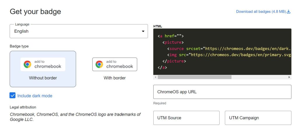
Now that we understand the importance of the Add to Chromebook badge, let’s dive into how to implement it effectively on your website or marketing materials.
1. Placement is Key
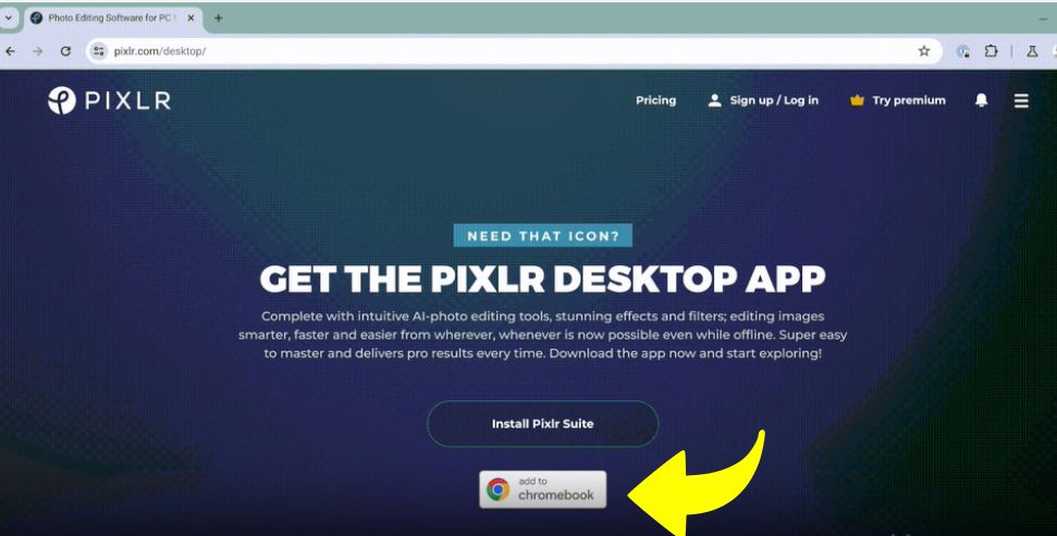
The golden rule of badge placement is visibility. You want potential users to see the badge at the moment they’re most likely to be interested in downloading or using your app. Consider these prime locations:
- Your website’s header or footer
- As a main call-to-action on your marketing pages
- On your app’s feature page
- Near or alongside download buttons
Remember, the goal is to catch the user’s eye without overwhelming your site’s design. A/B testing different placements can help you find the sweet spot for maximum impact.
2. Size Matters
Google has specific requirements for the badge size to ensure legibility and impact:
- For on-screen display (web included): Minimum height of 50dp (density-independent pixels) or 50px
- For print materials: Minimum height of 0.3 inches (7.6mm)
Pro tip: While these are minimum sizes, don’t be afraid to go bigger if your design allows. A larger badge can draw more attention, especially if you’re featuring it as a primary call-to-action.
3. Respect the Space
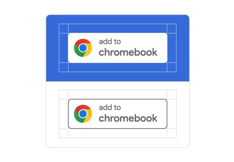
Your Add to Chromebook badge needs room to breathe. Google recommends maintaining clear space around the badge equal to three-tenths of its height. This translates to:
- 15dp for screen displays
- 15px for web use
- 0.09 inches (2.28mm) for print materials
This clear space ensures the badge stands out and remains easily recognizable, enhancing its effectiveness in catching user attention.
4. Color Considerations
The Add to Chromebook badge comes in two official color variants:
- White (Primary): This is the preferred version and should be your go-to choice in most situations.
- Black: Use this alternative only when the white badge doesn’t work well with your background.
It’s crucial to never alter the colors of the badge. Stick to the official versions to maintain consistency and credibility.
5. Keep It Authentic
The integrity of the Add to Chromebook badge is paramount. To ensure you’re using it correctly:
- Never modify the badge design
- Don’t use outdated versions
- Avoid rearranging or removing elements
- Ensure the badge is always legible and unobstructed
6. Size Comparisons
If you’re displaying the Add to Chromebook badge alongside other app store badges or download buttons, make sure it’s at least the same size, if not larger. This equal (or greater) prominence helps reinforce the importance of Chromebook compatibility to your users.
7. Background Matters
The Add to Chromebook badge should always be displayed on a background that makes it stand out:
- Solid color backgrounds work best
- If using a background image, ensure it’s simple and doesn’t interfere with badge visibility
8. Language Localization
Whenever possible, use a version of the badge that matches the language of the page it’s displayed on. This attention to detail can significantly improve user experience and conversion rates in different markets.
Linking Your Badge – The Gateway to Downloads
The Add to Chromebook badge isn’t just for show – it should lead users directly to where they can get your app. Here’s how to set up your badge links effectively:
For Android Apps:
If your app is available on Google Play, simply use your Google Play store link. This creates a seamless path for users to download your app onto their Chromebook.
For Web Apps:
You have two options:
- Deep-link directly into your app
- Use the badge to trigger your custom install prompt
If you’re unsure about which URL to use, don’t hesitate to reach out to the ChromeOS team. They’re there to help ensure you’re providing the best possible experience for your users.
Common Pitfalls to Avoid
Even with the best intentions, it’s easy to make mistakes when implementing the Add to Chromebook badge. Here are some common errors to watch out for:
- Color Modifications: Never alter the badge colors, even if you think it might look better with your site’s color scheme.
- Element Rearrangement: The badge design is carefully crafted. Rearranging or removing elements can confuse users and violate usage guidelines.
- Illegibility: Always ensure the badge is clearly visible against its background. An illegible badge defeats its purpose entirely.
- Outdated Versions: Keep an eye out for updated badge designs and replace old versions promptly.
- Inconsistent Sizing: Maintain consistent sizing, especially when displayed alongside other badges or buttons.
Beyond the Badge: Maximizing Your Chromebook App’s Potential
While the Add to Chromebook badge is a powerful tool, it’s just one part of a comprehensive strategy to succeed on the Chromebook platform. Consider these additional tips:
- Optimize for ChromeOS: Ensure your app takes full advantage of Chromebook features for the best user experience.
- Highlight Chromebook-Specific Features: In your app descriptions and marketing materials, call out any features that are particularly useful or unique to Chromebook users.
- Engage with the Chromebook Community: Participate in Chromebook forums and communities to understand user needs and showcase your app’s benefits.
- Leverage ChromeOS Developer Resources: Stay updated with the latest ChromeOS development tools and best practices to keep your app at the cutting edge.
- Gather and Act on Feedback: Pay special attention to feedback from Chromebook users to continuously improve your app’s performance and features.
End Note on the new “Add to Chromebook badge”
The Add to Chromebook badge is more than just a marketing tool – it’s your app’s passport to the vibrant and growing world of Chromebook users. By implementing this badge correctly and following the best practices outlined in this guide, you’re not just adhering to Google’s guidelines; you’re making a statement about your commitment to providing an excellent experience for Chromebook users.
Remember, the journey doesn’t end with adding the badge to your website. Continuously optimize your app for ChromeOS, engage with your users, and stay on top of the latest Chromebook developments. With the Add to Chromebook badge as your ally, you’re well-positioned to capture the attention of Chromebook users and stand out in an increasingly competitive app marketplace.
So, what are you waiting for? It’s time to badge up and let the Chromebook world know your app is ready to roll!
